


freshman google doodle (2020)

sophomore fear factor project

For this project, we were instructed to pick a fear and capture it using our photography and editing skills. Utilizing editing programs we learned in shop, as well as ones I was familiar with, I created this showcase to illustrate and dramatize the fear of plants.


We were instructed we could add any elements necessary to capture this concept for our chosen fear. For my fear, I picked fear of plants. I wanted to pick a fear that was unique and abstract. I had to research several fears before selecting my final, but botanophobia seemed to grab my interest.
To get started with this project, I first went to Pinterest and Google for some ideas of how I wanted to accurately capture this fear. I made a few blueprints based on other ideas I found from the web and ones I brainstormed on my own. Once I cut down to one idea, I researched images of “scared poses” that my younger brother would take of me. I wanted it to appear as if the person with the fear, or subject (me), was being engulfed by a forest of plants, weeds and vines. The biggest challenge for this project (having to be completed at home) was finding a shooting location that I would capture. Because I didn’t have a set studio space, I had to find somewhere within my house for the project to be successful. I also had to account for lighting and equipment. I wanted the photo to be in a darker room that was (or appeared) empty, with plants and trees creeping through cracks and floorboards.
I collected various images of grunge, creepy, and dangerous plants, I felt would work great for my design. After I picked my shoot location, I had my brother take pictures of me using my Canon camera. He had little experience with cameras, but he’s a pretty fast learner and was able to retain some of the information from my “tutorials”. I asked him to take the photos while lying flat on the floor, while I posed in the various positions. I went through and picked the best one.
Finally, I was ready to edit in my plants, and bring this fear to life. I used Adobe Photoshop and a photo editing program called Picsart (that I was already familiar with), to edit in the elements and effects. This part of the process required a lot of trial and error. For the typography aspect, in Photoshop I added the text and played with the layout and font. After I was satisfied with those results, I added some of the collected images in photoshop, then scaled and arranged my plants so that everything flowed nicely. Now I was ready to go into Picsart. I used vines as a sticker tool, adding them along walls my body, along with a few other plants I found in the app.
For the finishing touches, I added some filters, as well as shadows and effects.
Overall I was really satisfied with the results. Although this project took several days to complete, I really enjoyed being able to use different media and skills. I even got to challenge myself to use my resources when given this project in unusual circumstances.
click the images to view original artists work!
Using my skills with typography and layout, I created a National Geographic inspired magazine about a topic I felt had importance.
After review on InDesign we were handed this project. We could pick any topic (within school guidelines) for our "National Geographic" Magazine. Since we were given the creative freedom to let loose, I wanted to choose a topic I was passionate about.
The topic came rather easily to me. Having an Italian background, I know how often Italians get stereotyped - and our culture is often watered down. I wanted to create a visually appealing and informative magazine to educate Americans and other cultures reading what really made up my culture.

(interactive slideshow, click the arrows)
sophomore nat geo mag project
To get started I went to Google and Pinterest and collected some photos I wanted to include, as well as, mapped some categories I wanted to address in the magazine. Once I had a plan down on paper, I went and collected the articles. In each article I selected a part of the text I wanted to use in the layout. I used some real National Geographic magazines, along with magazines like Vogue and Harper's Bazaar to get layout inspiration.
At that point, since (most) of the prep work was done, it was time to open up Adobe Indesign and create some pages for our base. The "masters pages" feature let us create blueprints or templates for our design that we could use multiple times.
I reimagined some of the layouts I choose in Indesign. It was important to set up grids and play with margins to accomplish the right look. Finally I went in and picked a color and font scheme.
sophomore ray gun
magazine project
When I was first exposed to Raygun Magazine, I thought it was one of the coolest things. I was familiar with mixed media, but seeing it brought to life in a magazine, breaking all the design rules, was inspiring.

The magazine issued different rock artists and bands, but since I’m not a fan of rock music, I wanted to choose a rapper. I choose to pick Ski Mask the Slump God for my artist because he’s one of the few rappers whose music I really like. It’s strange, different, and exciting. Ski Mask can rap about anything, and I figured I could include some of his cool lyrics in my project. First, I compiled a bunch of images I liked of the rapper and added them in a folder to pick and choose out of later. Believe it or not, this was one of the hardest parts of the project. My artist didn’t have many public photo's, especially high-quality ones. But after about a day or so of searching, I was ready to move to the next step.
I browsed through some Raygun issues and some past shop student's projects, to get an idea and started with the inside spread. Ski Mask has a lot of tattoos, 14 (known to the public). Each tattoo has a significance to him, and I thought it would be really cool if I incorporated his tattoos in my designs. I looked for the closest images I could find to his tattoos before printing them along with a few other PNG elements I felt fit the theme (a few pictures of the artist that I liked, 100-dollar bills, chains, parental advisory sticker, etc.), before getting to the mixed media part.

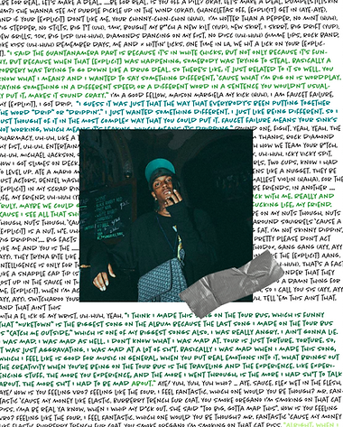
I decided I wanted to do half my project on the computer, and the other half off screens. Once I printed the images, I started constructing the work. I ripped up some black and white pages from magazines, as well as the photos I printed out. For my first mixed media page, I wanted to have the tattoos without a white background. First, I tried to see if I could make the cutout more transparent by soaping it in water and glue, but after that failed, I used the lightbox and tracing paper to paste on the tattoos. I added the image I chose of my artist that edited it in photoshop (lowering saturation, minor adjustments) by pasting them with glue water. Once this was dry, I used a drybrush technique with a green and white paint to create a distressed look.
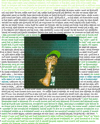
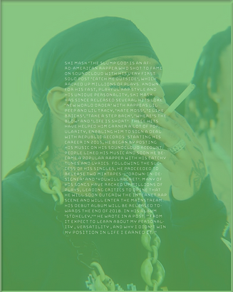
For my second mixed media page I found a image of my artist in green, so I printed this one in-color because it went with my green and black color scheme. I searched through magazines for song lyrics and cutouts of letters I could use. I used a green tye-dyed scrapbook page for the base of this page, then pasted Ski Mask the Slump God in the corner, added the cut out letters, and glued a green and black magazine page over that.
When the construction was finished I scanned my image in. I used photoshop to edit the digital pages. When I finished I printed the project and photographed it.


sophomore google doodle project
This project was my second Google Doodle project. I like doing doodle for google because it gives other young creators a chance to become part of something big. Each year Google Doodle has a new objective. This year the theme was strength. What does strength mean to you? When we think of strength, most of us think of the physical aspect. But strength is also pushing through a hard circumstance or proving how capable and worthy you truly are.
I started by brainstorming some ways I determine strength. Military service and protecting others even though it can put you in danger, unity, and equality - to lean on a friend or fight through injustice, being an essential worker during the pandemic and always; aiding those who cannot help themselves, overcoming grief or being a single parent/ guardian, or loss of a child or loved one, physical strength, and fighting through addiction.
I wanted to use a comic book art style and muted color scheme. Using Adobe Illustrator and the iPad pro, I drew my images. My design was not selected.
sophomore album cover and sleeve design


sophmore "cooper hewitt"
impact project

The Cooper Hewitt Competition of Inclusivity Design
Inclusive design is essential for overcoming exclusion and inequality in the world. Designers today look at the breadth of human diversity and help people of different genders, languages, and cultures have a sense of belonging as they live, work, and play. Using empathy, designers think critically and intentionally about the obstacles that would make people feel excluded and design innovative solutions to empower them and create inclusion for all.
Using Adobe XD I created several app prototypes. This was my most trying and tiring multimedia project I have ever worked on. Several nights I stayed up past 1am to work on this project. I had no previous experience on Adobe XD so this project was entity trial and error. I was so passionate about this app, I discovered design strengths I never thought were possible before.
Learn more at Cooperhewitt.org


junior "two portraits" magazine cover


For this project we first had to take our pictures using two different types of lighting. My favorite photo was the one using split lighting. I felt it was dramatic and eerie. I edited the photo in photoshop and played with exposer and contrast. Then I made the whole image black and white.

For my mood board I decided on a theme or a "mood" for my overall project. I wanted something vintage Hollywood. I found some examples I got inspired from, as well as some possible headlines. I chose to do TIME Magazine.
When I started the project in Adobe Indesign, there was no trouble or error and I ended up satisfied with my designs in just a few hours. I used a variation of caption .


what is a motion graphic?
pieces of animation or digital footage which create the illusion of motion or rotation, and are usually combined with audio for use in multimedia projects.

The motion and infographic was a multistep project where we were given the creative freedom to pick any topic to collect data on, and make an infographic and motion graphic on the topic.
step 1: choosing the topic and collecting research
When selecting my topic, I had to keep in mind that the topic would have to have information I could collect and put into visual data. I chose to do immigrant communities because I've heard stories of life in these communities and the pressure and hardships they face. I wanted to bring attention to this topic by targeting those who don't live in immigrant communities.
For research I went to various sites, but the one I found most useful with information was Point2homes.com. The most difficult part of the research was collecting data on mental health. I knew suicide and substance abuse was common from people I had talked to, but there was very little physical data.
what is an infographic?
graphic visual representations of information, data, or knowledge intended to present information quickly and clearly
step 2: infographic wireframe
This was simple and had little detail. Completed in Indesign.

step 3: make graphics and charts
The graphics were the most time consuming part. I had he concept idea to include graphics you would see in the city, including elements from each of the cultures. I wanted the elements to pop out and appear 3 dimensional. Then for the charts I chose different colors for each city graph and three different types of graphs.
step 4: add text and quotes
Using quotes and text I saved from a separate document, I picked out the fonts, size, color and layout that would fit into all the spaces I had.
step 5: isolate elements for export
In the Indesign project, I had to group and export elements in order to animate them. Certain elements were isolated and exported for animation.

step 6: motion graphic story board
Since I'm not skilled in animation, this part was more challenging. Working in Premiere Pro, I brought graphics to life using effect controls such as position, scale, rotation, and opacity. Using keyframes, I can adjust the timing in which each element moves. Since I had a very large infographic with a lot of information and data points, I took the information I found most relevant and brought it into the video. I found audio I liked that I felt was best aligned with the information being presented. Then I went in and added sound effects. I am not super proud of the motion graphic since there were several bits that were choppy. However, I liked this project and enjoyed presenting my poster in a new media form.
junior infographic and motion graphic
junior jewelry product photography and web mockup


junior prom "enchanted forest" invitation and poster

junior GUCCI corporate branding project
The goal of this project is to pretend you are hired as a creative professional for an organization of your choice. Your company provides a set of Branding Identity Guidelines that you will be required to work within when creating marketing pieces for their organization.
The company I chose for the corporate branding project was Gucci. I've always associated Gucci with being bright and bold, different, and even a little bit peculiar. I thought this would be a great company to design for. As I expected, Gucci brand guidelines weren't as strict as other companies.
Now, it was time to do a sketch and then comp in Procreate.


disclaimer: i don't own the rights to any of these images, nor is this work in collaberation with gucci

original
For the poster ad, most of them I simply worked on typography and used already composed Gucci images. But for the handbag ad, I took the bag from the white background and added the elements in photoshop.
animated ad


bring images together with photoshop
bring into after effectsand animate water ripple + add text
Video Commercial
junior final (product catalog)


senior beverage campaign


For this beverage campaign we had to design a beverage brand, create logos, design three label variations, attach the labels to bottles and photograph them, and edit advertisements.
what is sizl?

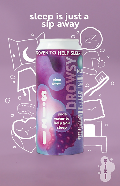

sizl's target audience is ages 18-24 in college or working, that want to switch to a "healthier lifestyle". the
product is to help them sleep, to give them energy, and to help them focus. I used bright colors in advertisements and listed health benefits to get the consumers attention. This beverage has positive effects on health while other soft drinks and energy have negative, if any.
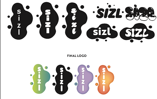
label design


senior superintendents dinner invite
For this project we had to create an invitation for the 29th Annual Superintendent Gourmet Dinner with the theme of Polynesia.
First, I read several articles about Polynesia and took notes. Then I went to Pinterest and Google and looked up travel posters for Polynesia and put together several graphic elements I wanted to include in my design. I had two separate ideas for this invitation so I wanted to create two different products. I really liked the idea of a three dimensional layered map, which was something I had never seen on an invitation before so it required a lot of creativity to translate this idea into image format. I played around with color pallets and went for fresh and bright colors. I wanted my design to represent Polynesian culture beyond just the stereotypical plants, waves, and flowers. I brought in Polynesian art elements by drawing a wave pattern I had seen in several examples of in Polynesian art. I really liked the idea of the invite having wood grain and texture to appear as if the design was etched on wood. I included this element in both invitations. I edited designs in both Illustrator and Photoshop.
senior cosmetology client

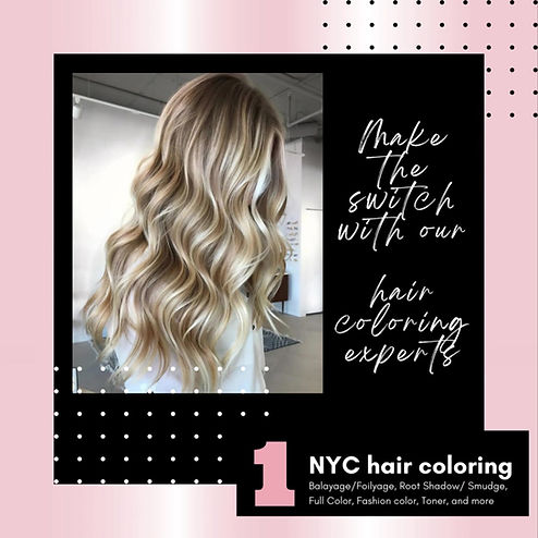
A selected senior in the Cosmetology Shop collaborated with me to design a series of marketing pieces for their future cosmetology business, including a logo; a business card; a menu card/brochure of services; and a social media ad. I treated this assignment as if I were collaborating with a real client.
To start off, I lead a consultation with student Emma Camosse to find out the information needed to create her business marketing materials. I gained the understanding that Emma wanted a chromaticity- in other words, a hair coloring studio. She wanted a pink, black, and gray color pallet and a design that was modern but also classy. I sketched some different logo designs that incorporated a monoline sketch of a woman with hair. I decided to go for a pink chrome look and I achieved this by a gradient color swatch. Once I had the logo finished, I couldn’t decide out of the inspiration of four designs I made, so I decided to make 2 different ones.
I wanted to incorporate that black with the logo so that it stood out.
Overall, I liked this project a lot because It was my first interaction with having a real "client" and adhering to their needs.


